File:Alertness homeostatic.jpg: Difference between revisions
No edit summary |
No edit summary |
||
| Line 1: | Line 1: | ||
<blockquote> | <blockquote> | ||
'''''Figure:''' '''[[Tools menu|Tools]] : [[Sleep Chart]] : Alertness (H)''' graph makes it possible for you to visually inspect how [[Glossary:Grade|grades]] decrease during the waking day. It also shows the impact of circadian factors with grades slightly lower immediately after waking and slightly higher after the mid-day dip in the 9th hour. The <span style="padding: 3px; color: #FFF; background-color: blue;">blue dots</span> are recall data illustrating decline in performance during a waking day from 87.5% on waking to 81.5% at midday nadir (size of the circles corresponds with repetitions collected; minimum 50 repetitions needed to paint a circle). The <span style="padding: 3px; background-color: yellow;">yellow line</span> is the estimated homeostatic alertness derived from the sleep log data. The <span style="padding: 3px; background-color: aqua;">aqua line</span> represents the circadian alertness estimate derived from the same sleep log data. 0.1 (hours) (at the bottom) is the minimum sleep block length taken into consideration. 101,230 repetitions cases were taken to plot the graph. The '''Deviation''' parameter displayed at the top tells you how well the chosen approximation curve fits the data (in the picture: negatively exponential recall curve). The lesser the deviation, the better the fit. The deviation is computed as a square root of the average of squared differences (as used in the method of least squares). Depressed '''Use R''' will use grade-R correlations for an average student to estimate recall (R derived from the DSR model is not used here, as on the '''Alertness (C)''' tab, due to the slowness of the computation). Those correlated R figures may differ from actual recall (as displayed on the picture).'' | '''''Figure:''' '''[[Tools menu|Tools]] : [[Sleep Chart]] : Alertness (H)''' graph makes it possible for you to visually inspect how recall (and [[Glossary:Grade|grades]]) decrease during the waking day. It also shows the impact of circadian factors with grades slightly lower immediately after waking and slightly higher after the mid-day dip in the 9th hour. The <span style="padding: 3px; color: #FFF; background-color: blue;">blue dots</span> are recall data illustrating decline in performance during a waking day from 87.5% on waking to 81.5% at midday nadir (size of the circles corresponds with repetitions collected; minimum 50 repetitions needed to paint a circle). The <span style="padding: 3px; background-color: yellow;">yellow line</span> is the estimated homeostatic alertness derived from the sleep log data. The <span style="padding: 3px; background-color: aqua;">aqua line</span> represents the circadian alertness estimate derived from the same sleep log data. 0.1 (hours) (at the bottom) is the minimum sleep block length taken into consideration. 101,230 repetitions cases were taken to plot the graph. The '''Deviation''' parameter displayed at the top tells you how well the chosen approximation curve fits the data (in the picture: negatively exponential recall curve). The lesser the deviation, the better the fit. The deviation is computed as a square root of the average of squared differences (as used in the method of least squares). Depressed '''Use R''' will use grade-R correlations for an average student to estimate recall (R derived from the DSR model is not used here, as on the '''Alertness (C)''' tab, due to the slowness of the computation). Those correlated R figures may differ from actual recall (as displayed on the picture).'' | ||
</blockquote> | </blockquote> | ||
Revision as of 05:39, 3 April 2016
Figure: Tools : Sleep Chart : Alertness (H) graph makes it possible for you to visually inspect how recall (and grades) decrease during the waking day. It also shows the impact of circadian factors with grades slightly lower immediately after waking and slightly higher after the mid-day dip in the 9th hour. The blue dots are recall data illustrating decline in performance during a waking day from 87.5% on waking to 81.5% at midday nadir (size of the circles corresponds with repetitions collected; minimum 50 repetitions needed to paint a circle). The yellow line is the estimated homeostatic alertness derived from the sleep log data. The aqua line represents the circadian alertness estimate derived from the same sleep log data. 0.1 (hours) (at the bottom) is the minimum sleep block length taken into consideration. 101,230 repetitions cases were taken to plot the graph. The Deviation parameter displayed at the top tells you how well the chosen approximation curve fits the data (in the picture: negatively exponential recall curve). The lesser the deviation, the better the fit. The deviation is computed as a square root of the average of squared differences (as used in the method of least squares). Depressed Use R will use grade-R correlations for an average student to estimate recall (R derived from the DSR model is not used here, as on the Alertness (C) tab, due to the slowness of the computation). Those correlated R figures may differ from actual recall (as displayed on the picture).
File history
Click on a date/time to view the file as it appeared at that time.
| Date/Time | Thumbnail | Dimensions | User | Comment | |
|---|---|---|---|---|---|
| current | 04:34, 3 April 2016 | 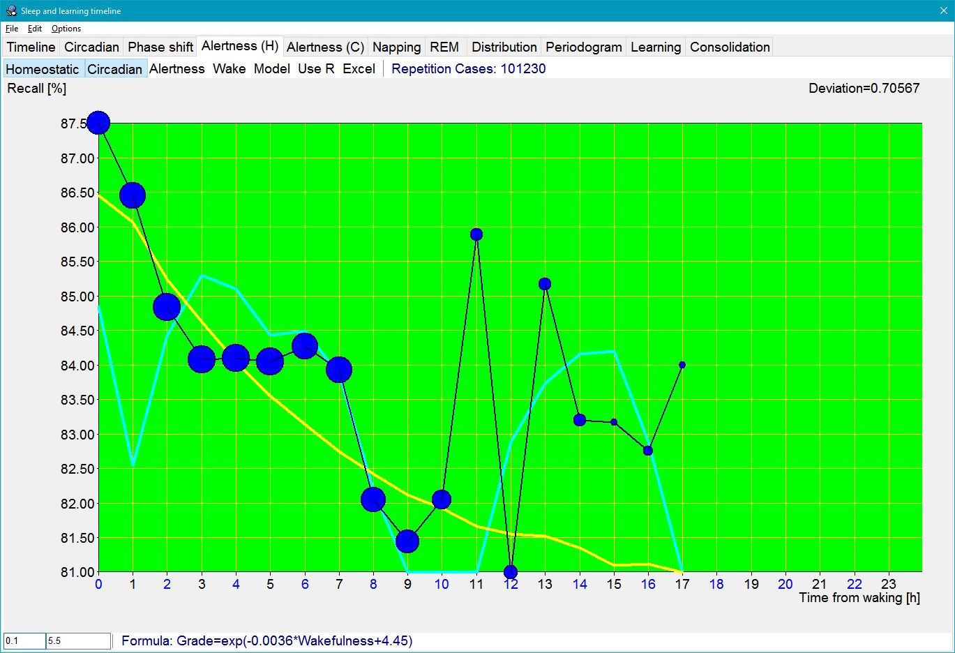 | 1,369 × 936 (192 KB) | SuperMemoHelp (talk | contribs) | |
| 11:45, 12 October 2013 |  | 1,278 × 951 (188 KB) | SuperMemoHelp (talk | contribs) | ||
| 09:21, 24 April 2009 |  | 1,046 × 756 (128 KB) | WikiSysop (talk | contribs) | Tools : Timeline : Alertness graph makes it possible for you to visually inspect how grades decrease during the waking day. It also shows the impact of circadian factors with grades slightly lower immediately after waking and slightly higher after the mid |
You cannot overwrite this file.
File usage
The following 3 pages use this file: